A best-in-class approach to keep on the cutting edge.
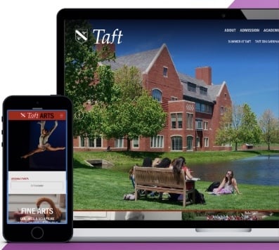
When Finalsite launched its first responsive school website in 2012, mobile web strategy was still in its infancy – and yet to be adopted by big web names like Buzzfeed and Amazon. Since 2012, Finalsite has grown to be the market leader in not only responsive design, but mobile-first design.
While responsive websites are mobile-friendly, our design process is mobile-first, meaning we consider how the design will respond to different devices during the entire design process. Statistics show that between 50-70% of users accessing your website are coming from some sort of a mobile device (be it a smartphone or tablet), therefore our designers are considering the user experience on mobile as much as they are desktop design.
Of mobile UI and UX. The Device Preview tool will allow you to see how the pages you build look in different devices.
On content, structure, and navigation from your designer and project manager
Including guided tours of how to use Composer and up-to-the-minute updates on feature releases.